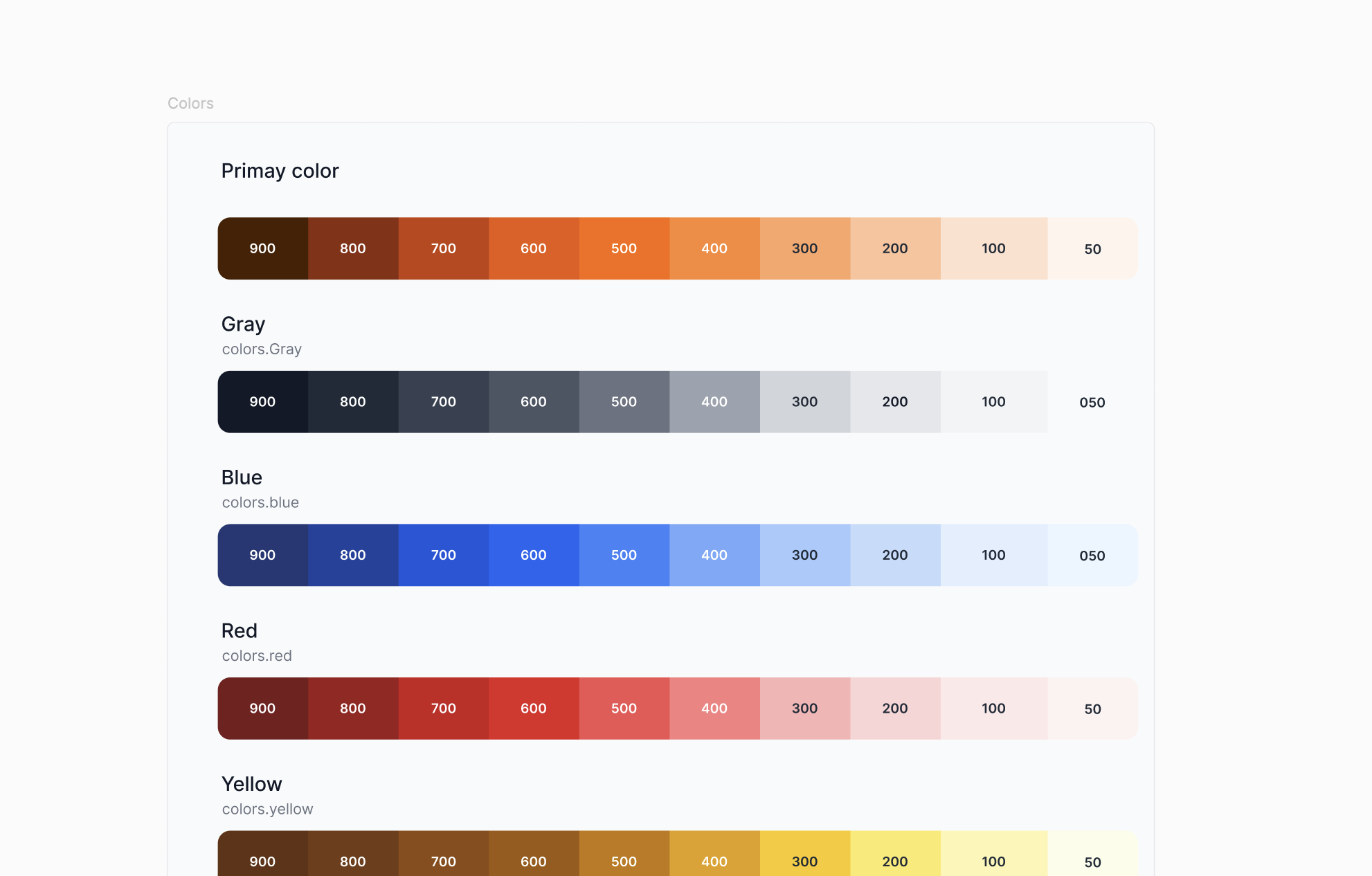
Hello there
Hi emoji
❤️‍🔥 Feature Works
For atama+, I worked on the website from its initial launch as a new project through continuous improvements for long-term operation. My role covered both design and development, focusing on building a stable and scalable web experience. I was responsible for development in Webflow, implementing custom code, optimizing SEO and AEO, and creating reusable design patterns. Through ongoing iteration, I supported the site’s growth while maintaining consistency, performance, and clarity.
atama+
Web Design
Development
SEO
For atama+, I worked on the website from its initial launch as a new project through continuous improvements for long-term operation. My role covered both design and development, focusing on building a stable and scalable web experience. I was responsible for development in Webflow, implementing custom code, optimizing SEO and AEO, and creating reusable design patterns. Through ongoing iteration, I supported the site’s growth while maintaining consistency, performance, and clarity.
Simplee is a minimalist web platform designed to help users organize and present information in a clear, calm, and intuitive way. The project focuses on reducing visual and cognitive noise by prioritizing simplicity, hierarchy, and thoughtful interaction design. Rather than adding features, Simplee explores what happens when unnecessary elements are removed — allowing content itself to stand out. As a UI/UX designer and developer, I was responsible for the overall concept, interface design, and implementation. Through this project, I aimed to create a digital experience that feels quiet, approachable, and easy to use, while still being flexible enough for different types of content.
Simplee
UI/UX
Simplee is a minimalist web platform designed to help users organize and present information in a clear, calm, and intuitive way. The project focuses on reducing visual and cognitive noise by prioritizing simplicity, hierarchy, and thoughtful interaction design. Rather than adding features, Simplee explores what happens when unnecessary elements are removed — allowing content itself to stand out. As a UI/UX designer and developer, I was responsible for the overall concept, interface design, and implementation. Through this project, I aimed to create a digital experience that feels quiet, approachable, and easy to use, while still being flexible enough for different types of content.
BucketLine is a social app that enables users to create, share, and update their personal bucket lists through a simple, SNS-like experience. The app turns life goals into something visible and ongoing, rather than something written once and forgotten. By allowing users to revisit, edit, and share their goals with others, BucketLine encourages reflection, inspiration, and motivation in everyday life. The project aims to help users clarify what they truly want to do and make their daily lives feel more intentional and fulfilling.
BucketLine
UI/UX
BucketLine is a social app that enables users to create, share, and update their personal bucket lists through a simple, SNS-like experience. The app turns life goals into something visible and ongoing, rather than something written once and forgotten. By allowing users to revisit, edit, and share their goals with others, BucketLine encourages reflection, inspiration, and motivation in everyday life. The project aims to help users clarify what they truly want to do and make their daily lives feel more intentional and fulfilling.
🚀 About me

A freelance UI/UX designer and Web Developer from Japan, creating digital experiences that inspire curiosity and resonate with people’s emotions. Known for my adaptability and self-driven approach, I bridges UI/UX and product design to deliver meaningful interactions that spark new perspectives.

About
🤔 Why choose me?
[01]
Creative ideas

Generating fresh concepts that spark curiosity and transform challenges into engaging design solutions.

[02]
Design-to-code skills

Experienced with Next.js, GitHub, and Tailwind CSS, enabling smooth collaboration with developers and the ability to prototype or build directly.

[03]
Adaptability
& self-drive

Thriving as a freelance designer, with proven ability to work independently and embrace new challenges.

[04]
Expert in tools

Proficient in Figma, Webflow, and prototyping tools, bringing ideas to life quickly and effectively.

🧩 Works
UI/UX
Development
Logo / Branding
Web Design
SEO
ALL
Thank you! Your submission has been received!
Oops! Something went wrong while submitting the form.
[
01
]
atama+
Web Design
Development
SEO

1. Overview

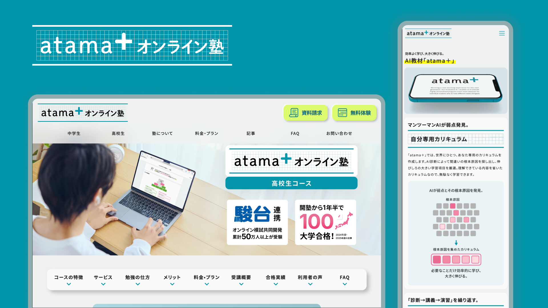
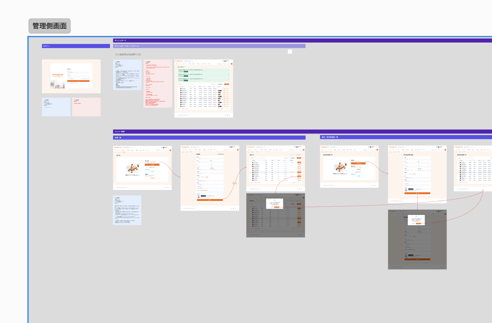
atama+ is an EdTech company that provides AI-powered learning support services.

In this project, I have been continuously responsible for the launch, operation, and maintenance of the online tutoring service website for over two years.

In the initial phase of the project, I worked with a team of approximately 4 members to launch the service site,

proceeding with implementation and improvement from a stage where the service direction and requirements were not yet fully established.

After the launch phase, I operated the service site in a two-person structure with a manager/marketer.

Working 1-3 days per week, I handled everything from short-term initiatives to medium- and long-term improvements,

engaging not just in "build and finish" but in a website that grows together with the business.

2. Project Background & Launch Phase

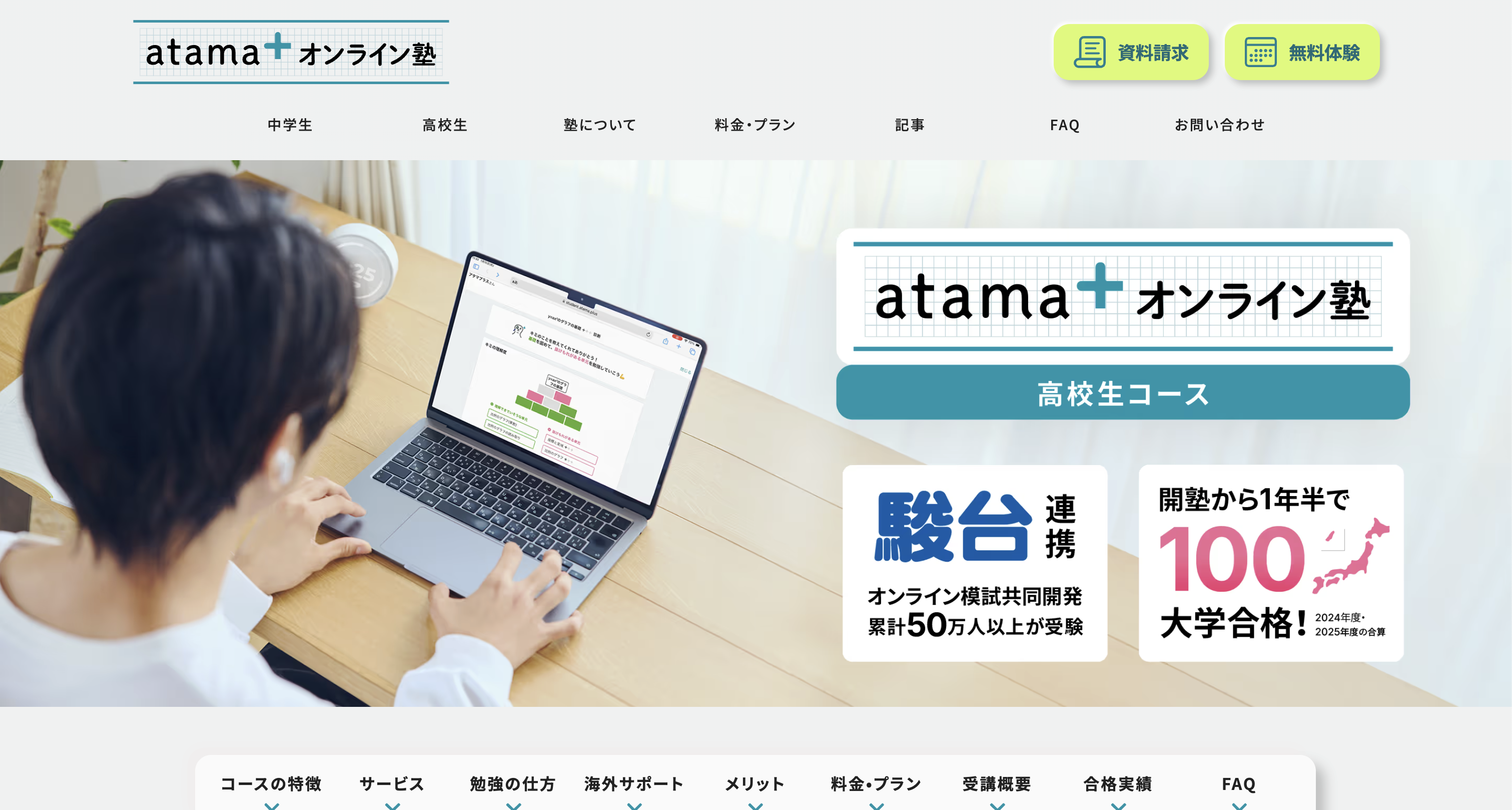
[Insert Image: Service Site Top Page or Initial LP]

Given the nature of an online tutoring service,

the service site was strongly required to have "clarity," "trustworthiness," and "a structure that can be continuously updated."

At the time of launch,

  • The necessary page structure and amount of information were not yet determined
  • The service itself was continuously being updated
  • Design that assumes future expansion and improvement was necessary

Under these circumstances, I was responsible for everything from initial structure design to implementation,

building a site with CMS and component design in mind so that it could withstand future modifications and expansions.

3. Scope & Role

In this project, I took on the role of receiving predetermined design tones and directions, and deploying and implementing them across the entire service site.

Rather than simply reproducing the appearance,

  • UI structure that doesn't break down during operation
  • Design deployment based on CMS updates
  • Application to LPs and subpages

I proceeded with implementation while being conscious of these aspects.

Specifically, I was responsible for:

  • Construction and modification of service sites and LPs using Webflow
  • UI deployment and component design based on design rules
  • CMS design and organization of collection structure
  • Extension of UI and behavior through custom code
  • SEO/AEO design and continuous optimization

The fact that we continue to operate the site in a form that can withstand practical use, without separating design, implementation, and operation, is a characteristic of this project.

4. Collaboration & Process

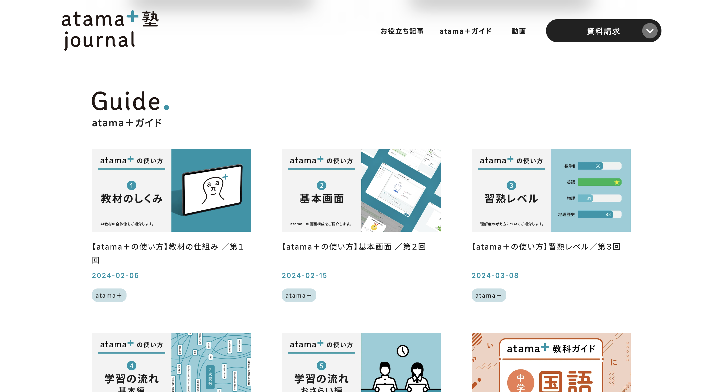
[Insert Image: CMS configuration / Page structure screen]

After the launch phase, I worked closely with the manager/marketer,

continuously making improvements aligned with initiatives and business goals.

  • LP production aligned with new initiatives
  • Structural adjustments accompanying content additions and organization
  • Improvements and fine-tuning while monitoring metrics

This is an operational structure that continuously cycles through these in small units.

We emphasized the cycle of "build first, use it, then improve,"

proceeding with a balance of speed and stability in mind.

5. Results & Business Impact

[Insert Image: Google PageSpeed Insights results]

As a result of continuous improvements, the service site has consistently delivered results,

recording achievement rates of 120-150% against business targets.

In addition, while utilizing metrics such as Google PageSpeed Insights,

I continuously implemented improvements in performance and SEO.

Through this, I was able to build and maintain:

  • Easy to operate
  • Stable in terms of performance
  • A website as a foundation supporting business growth

As a long-term project, this was a project where I could practically experience how a website can continue to contribute to the business.

[
02
]
FLINTZ
UI/UX
[
03
]
BLOOM
Development
[
05
]
Simplee
UI/UX

1. Overview

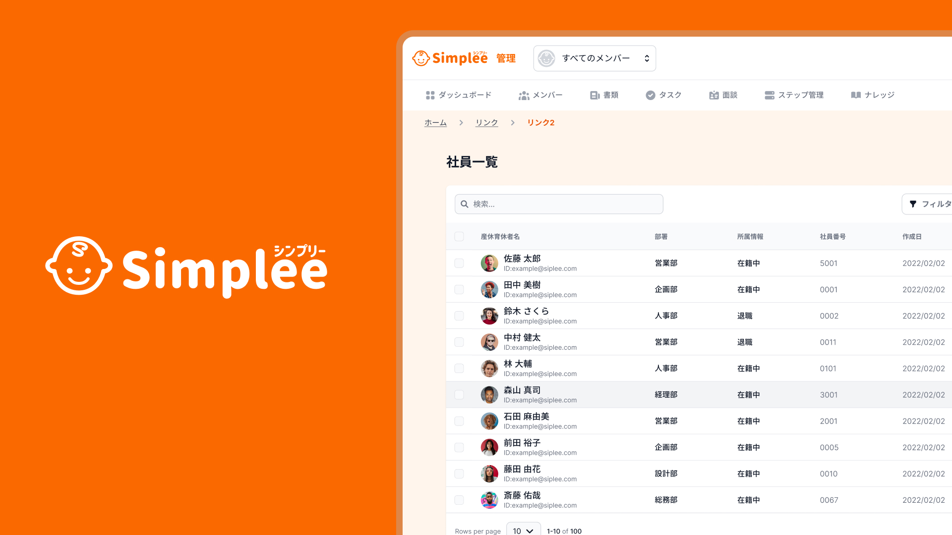
Simplee is a B2B SaaS concept designed for HR teams to make
parental leave (maternity / childcare leave) easier to manage, track, and understand.

I joined this project at a very early stage when only the business idea existed,
and worked as a UI/UX Designer, visualizing the concept and designing key screens.

  • Role: UI/UX Designer
  • Team: CEO / Designer (1) / Engineers (2–3) / Advisors
  • Work style: Weekly meeting + 1–2 days per week
  • Phase: Concept → Prototyping

2. Background

The CEO, who has personal childcare experience, identified a clear issue:

Parental leave systems exist, but are difficult to manage in practice.

In many HR teams:

  • Leave status is hard to grasp at a glance
  • Management relies on Excel or individual knowledge
  • Data is not usable for future workforce planning

A system that is easy to take, manage, and plan with was needed.

3. Purpose / Concept

he key concept was to create
“a tool that moves conversations forward”, not just explains regulations.

  • Visibility before accuracy
  • Shareability over control
  • Intuitive UI without requiring expert knowledge

Through close discussions with the CEO,
we aimed to create screens that HR, management, and teams could look at together.

4. My Role

As the sole designer, I was responsible for:

  • Structuring screens with unclear requirements
  • Designing both admin and applicant experiences
  • Information architecture and screen transitions
  • Dashboard and form UI design
  • Facilitating discussions using screens during meetings

5. UX / UI Design

Admin Side

  • Overview dashboard for quick decision-making
  • Visualized gender ratios and leave status
  • Minimal decoration, focused on clarity

Applicant Side

  • Lowering the psychological barrier to applying
  • Reducing form stress through simple UI
  • Helping users feel confident about submitting requests

Screens were always shared during meetings and refined based on one question:

What kind of conversation will this screen create?

6. Collaboration

  • Weekly meetings with CEO and engineers
  • Visualizing abstract ideas to move discussions forward
  • Designing with implementation in mind

As the only designer, I also acted as a translator between business ideas and product form.

7. Outcome

Although the project pivoted before development, it delivered strong value:

  • Business ideas became easy to explain and share
  • Screens were used in investor discussions
  • The project led to new connections and next opportunities

The CEO shared that the UI helped
“move conversations forward” and “make ideas tangible.”

8. Learnings

  • Early-stage products need progress, not perfection
  • UI can be a thinking tool, not just an interface
  • Designers add value even when there is no single correct answer

[
06
]
Van Bus cast
UI/UX
Development
Logo / Branding
[
07
]
BucketLine
UI/UX

1. Overview

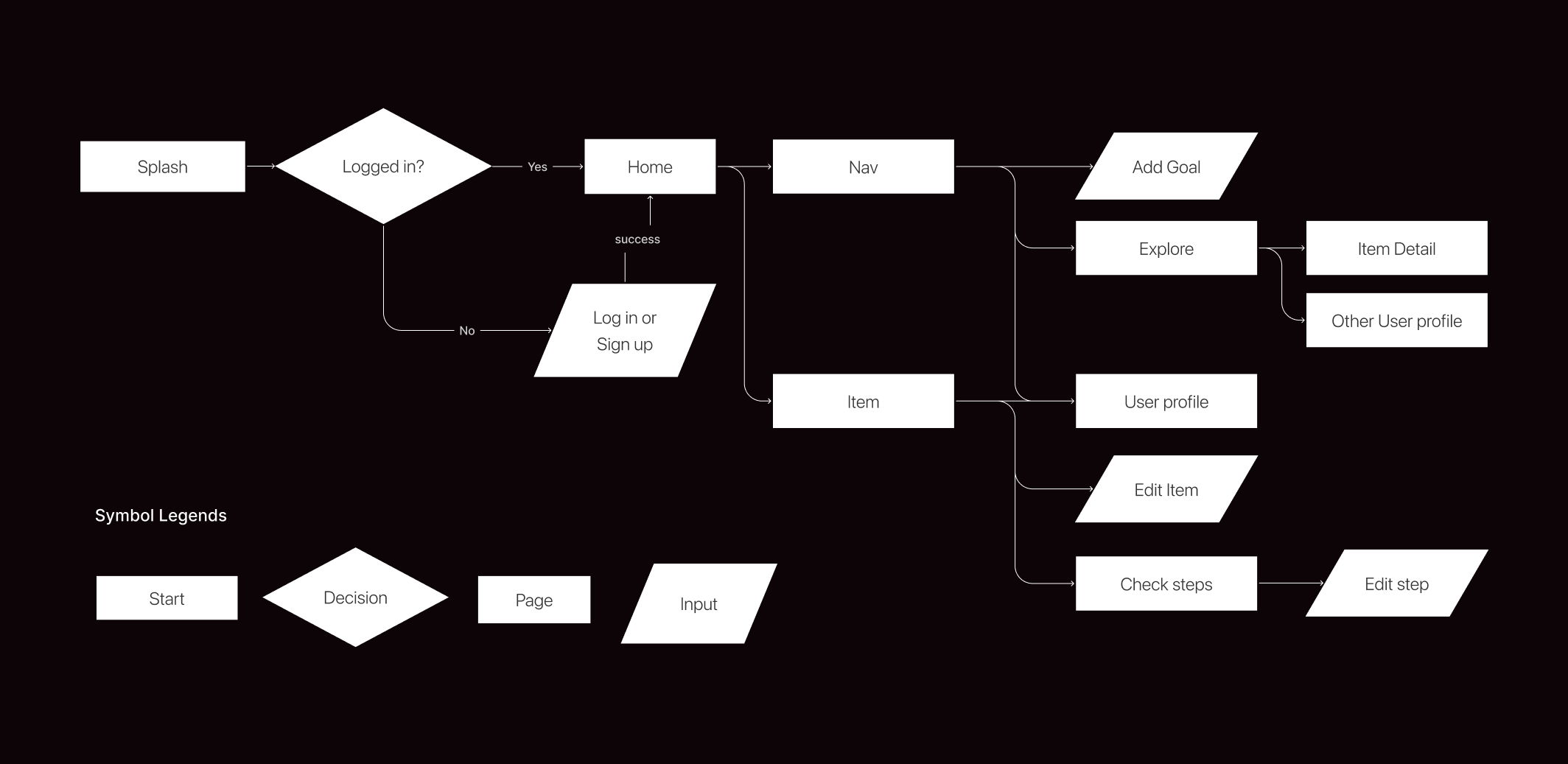
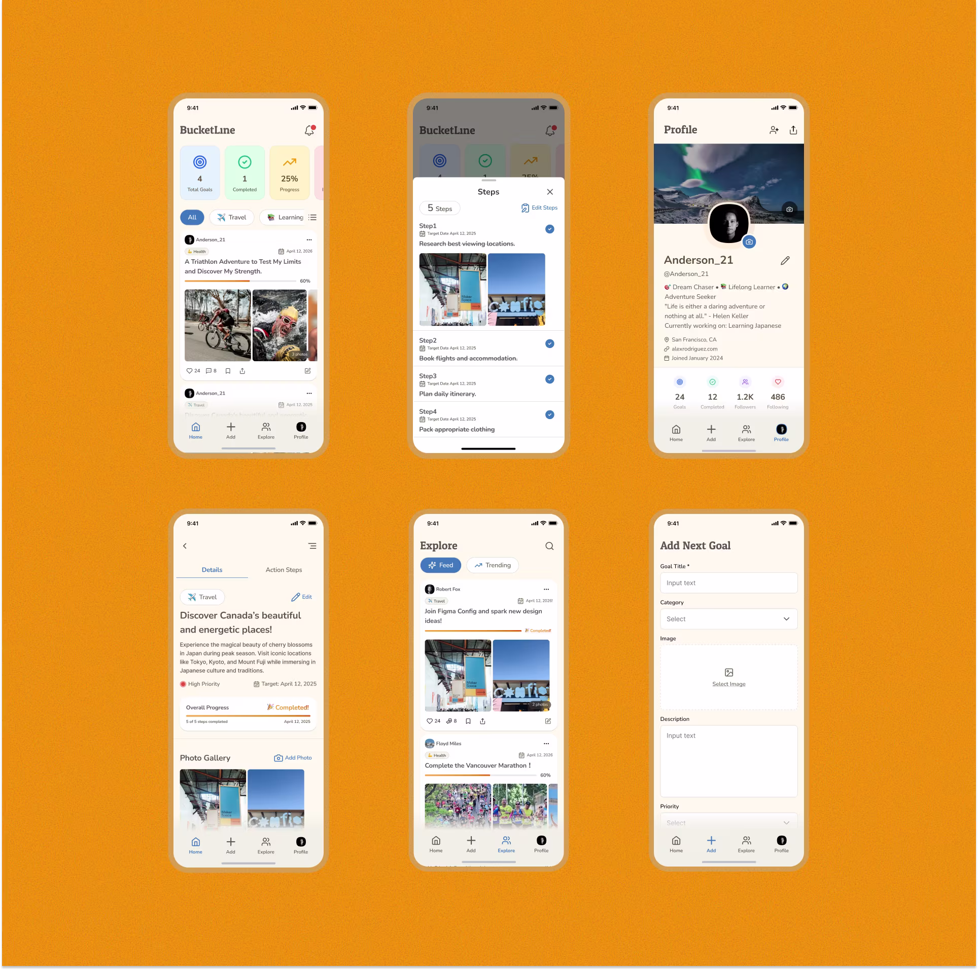
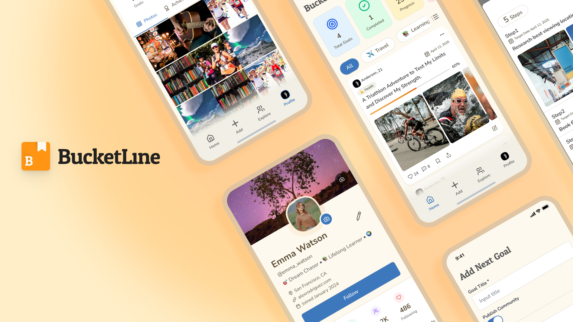
BucketLine is a social networking app for creating, sharing, and updating personal bucket lists — helping people clarify life goals and make everyday life more fulfilling.

2. Problem

In a world overflowing with information and distractions, many people find it hard to clearly define what they really want to do in life. Some write bucket lists by hand, but then struggle to update or revisit them. Others wish they could see what their peers are dreaming about — and get inspired.

User pain points:

  • Bucket lists are written on paper and easily forgotten.
  • There’s no way to share goals or get inspired by others’ dreams.
  • Hard to track progress or record feelings visually (like photos or notes).

3. Purpose & Goals

Purpose

  • To help users visualize and achieve their life goals in a fun and shareable way.

Goals

  • Help users achieve at least one “thing they want to do.”
  • Make creating, sharing, and updating bucket lists enjoyable and effortless.

4. Target Audience

  • Men and women in their 20s–30s
  • People who want to live a more meaningful life
  • Individuals in transition (studying abroad, changing jobs, or starting new challenges)

5. Key Features

Key features

6. Concept Message

Make your life visible.
Clarify what you truly want to do, share it with others, and make small steps every day.

7. User Flow

User flow

8. Styles

Styles

9. Final Design

Design
[
08
]
Soitabi
Logo / Branding
[
09
]
Kireii
Logo / Branding
[
10
]
SYEMPLE
Logo / Branding
[
11
]
ferro
Development
UI/UX
[
12
]
Nomura Dental Clinic
Logo / Branding
Numbers
8
Years of experience
20+
Projects completed
98%
Satisfied clients
14+
Industries served
8M+
Fundraised for clients
Testimonials
Review StarReview StarReview StarReview StarReview Star
Reviewer Image
Shigeki Matsushita
Marketer
"The designs were nothing short of spectacular. The designer has an incredible vision and the ability to translate ideas into visually stunning work. Our website traffic increased by 40% after the redesign"
Review StarReview StarReview StarReview StarReview Star
Reviewer Image
Kozumi Takemura
CEO / Art Director / Design Director
"Their work brought our brand to life in a way we never imagined. The user experience improvements on our app are phenomenal. This designer is a true professional with unmatched talent in UI/UX design."
Review StarReview StarReview StarReview StarReview Star